# Advanced R Tips and Tricks {.unnumbered}
A collection of practical solutions for common data visualization and analysis situations.
Based on: [github.com/zilinskyjan/R-snippets](https://github.com/zilinskyjan/R-snippets)
A slide deck version is available [here](https://rawcdn.githack.com/zilinskyjan/DataViz/2e38f94acb5465e7bfe1e7a438de6701f9cd344b/slides/r-snippets-teaching.html#/title-slide).
## Summary of Tips
| Tip | Solution |
|-----|----------|
| Wrap axis labels | `scale_x_discrete(labels = scales::label_wrap(20))` |
| Align title with plot | `theme(plot.title.position = "plot")` |
| Remove padding | `scale_x_continuous(expand = c(0, 0))` |
| Remove gridlines | `theme(panel.grid.major.y = element_blank())` |
| Format dates | `scale_x_date(labels = scales::label_date("%b '%y"))` |
| Fix legend order | `guides(fill = guide_legend(reverse = TRUE))` |
| Wrap facet labels | `facet_wrap(~ var, labeller = label_wrap_gen(width = 25))` |
| Hide legend | `geom_point(show.legend = FALSE)` |
| Transparent colors | `scales::alpha("blue", 0.5)` |
| Subset in ggplot | `data = . %>% filter(condition)` |
## Setup: Load Data and Create Summary
We'll use a dataset of news headlines about ChatGPT/AI collected from Media Cloud to demonstrate each tip. First, let's load the data and create a summary tibble.
```{r setup}
#| message: false
#| warning: false
library(tidyverse)
library(scales)

# Load the headlines data
headlines <- read_csv("data/mc-onlinenews-mediacloud-20250604193447-chatgpt-headlines.csv")

# Create a summary: count articles by media outlet
outlet_summary <- headlines %>%
  mutate(outlet = str_remove(media_url, "\\.com$|\\.org$|\\.net$")) %>%
  count(outlet, name = "n_articles") %>%
  slice_max(n_articles, n = 12) %>%
  mutate(
    outlet_label = case_when(
      outlet == "theguardian" ~ "The Guardian",
      outlet == "forbes" ~ "Forbes",
      outlet == "cnet" ~ "CNET",
      outlet == "techcrunch" ~ "TechCrunch Startup Coverage",
      outlet == "zdnet" ~ "ZDNet",
      outlet == "businessinsider" ~ "Business Insider Financial News",
      outlet == "techradar" ~ "TechRadar",
      outlet == "theconversation" ~ "The Conversation",
      outlet == "cbsnews" ~ "CBS News",
      outlet == "cnbc" ~ "CNBC",
      outlet == "reuters" ~ "Reuters",
      TRUE ~ outlet
    )
  )

# Preview the data
outlet_summary
```
We'll also create a time series summary:
```{r time-summary}
# Parse dates and count by day
daily_counts <- headlines %>%
  mutate(
    date = mdy(publish_date)
  ) %>%
  filter(!is.na(date), date >= "2024-11-01") %>%
  count(date, name = "n_articles")

head(daily_counts)
```
## Part 1: Data Visualization with ggplot2
### Wrapping Long Axis Labels
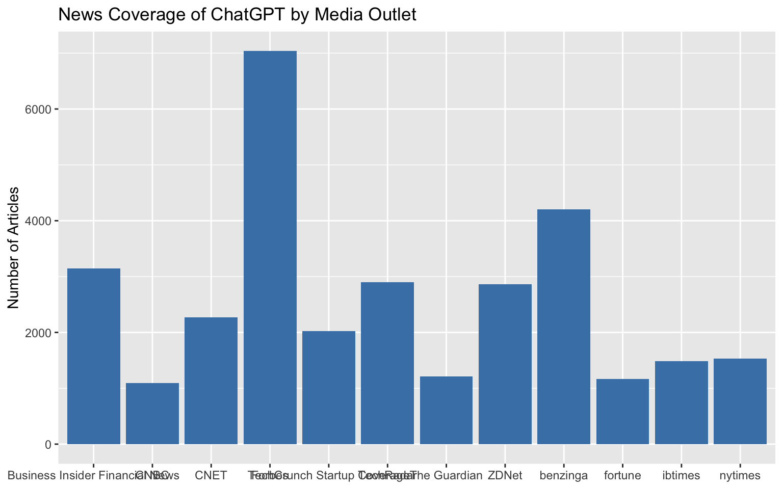
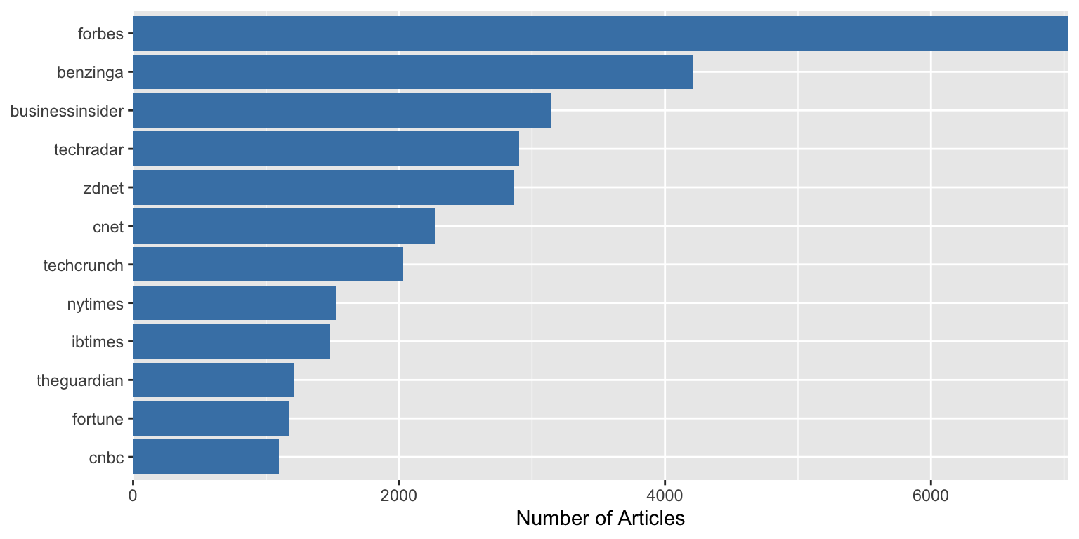
**Problem:** Category names overlap on axes
**Without the tip:**
```{r axis-labels-problem}
#| fig-width: 8
#| fig-height: 5
ggplot(outlet_summary, aes(y = n_articles, x = outlet_label)) +
  geom_col(fill = "steelblue") +
  labs(
    title = "News Coverage of ChatGPT by Media Outlet",
    y = "Number of Articles",
    x = NULL
  )
```
The labels are cut off or overlap because they're too long.
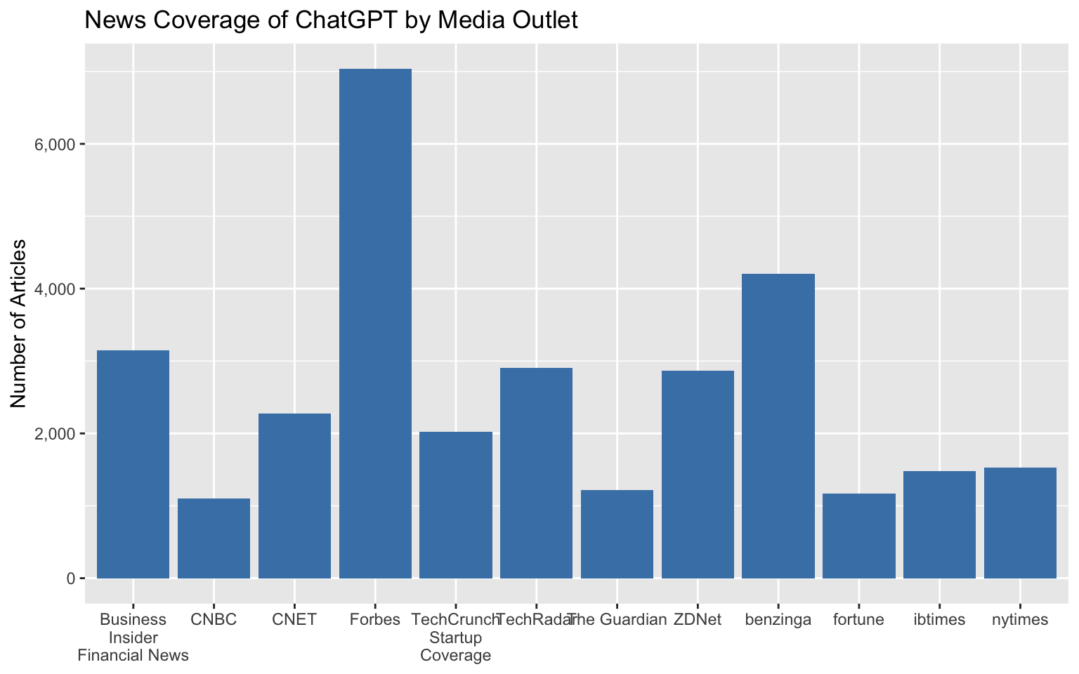
**With the tip applied:**
```{r axis-labels-solution}
#| fig-width: 8
#| fig-height: 5
ggplot(outlet_summary, aes(y = n_articles, x = outlet_label)) +
  geom_col(fill = "steelblue") +
  scale_x_discrete(labels = scales::label_wrap(15)) +
  labs(
    title = "News Coverage of ChatGPT by Media Outlet",
    y = "Number of Articles",
    x = NULL
  )
```
The `scales::label_wrap(15)` function breaks long labels into multiple lines at around 20 characters.
**Bonus:** Format numbers nicely:
```{r number-format}
#| eval: false
scale_y_continuous(labels = scales::comma)
```
```{r axis-labels-ctd}
#| echo: false
#| fig-width: 8
#| fig-height: 5
ggplot(outlet_summary, aes(y = n_articles, x = outlet_label)) +
geom_col(fill = "steelblue") +
scale_x_discrete(labels = scales::label_wrap(15)) +
scale_y_continuous(labels = scales::comma) +
labs(
title = "News Coverage of ChatGPT by Media Outlet",
y = "Number of Articles",
x = NULL
)
```
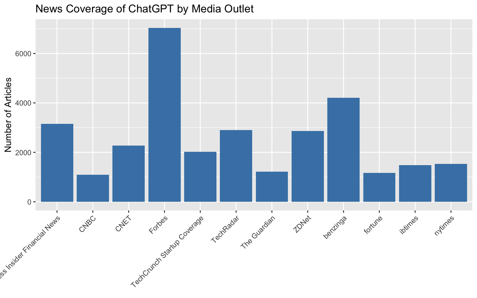
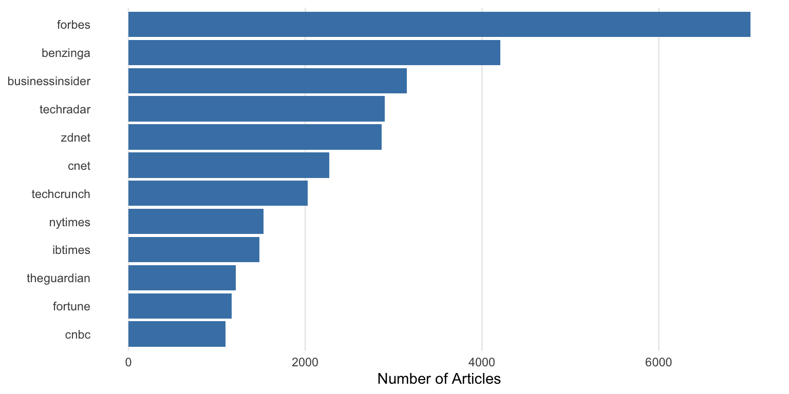
**Alternative (a classic solution but often will not look great):**
We could use:
```{r axis-labels-rotate}
#| eval: false
theme(axis.text.x = element_text(angle = 45, hjust = 1, vjust = 1))
```
The result:
```{r axis-labels-45}
#| fig-width: 8
#| fig-height: 5
ggplot(outlet_summary, aes(y = n_articles, x = outlet_label)) +
  geom_col(fill = "steelblue") +
  labs(
    title = "News Coverage of ChatGPT by Media Outlet",
    y = "Number of Articles",
    x = NULL
  ) +
  theme(axis.text.x = element_text(angle = 45, hjust = 1, vjust = 1))
```
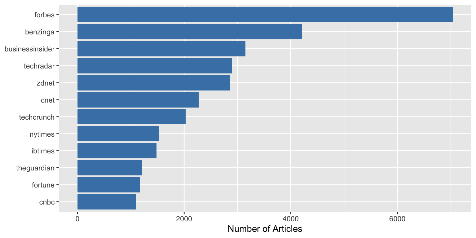
### Getting Rid of Awkward Padding
**Problem:** Unwanted padding around your plot
```{r padding-problem}
#| fig-width: 8
#| fig-height: 4
ggplot(outlet_summary, aes(x = n_articles, y = reorder(outlet, n_articles))) +
  geom_col(fill = "steelblue") +
  labs(x = "Number of Articles", y = NULL)
```
Notice the gap between the bars and the y-axis.
**With the tip applied:**
```{r padding-solution}
#| fig-width: 8
#| fig-height: 4
ggplot(outlet_summary, aes(x = n_articles, y = reorder(outlet, n_articles))) +
  geom_col(fill = "steelblue") +
  scale_x_continuous(expand = c(0, 0)) +
  labs(x = "Number of Articles", y = NULL)
```
The bars now start directly at the axis with `expand = c(0, 0)`.
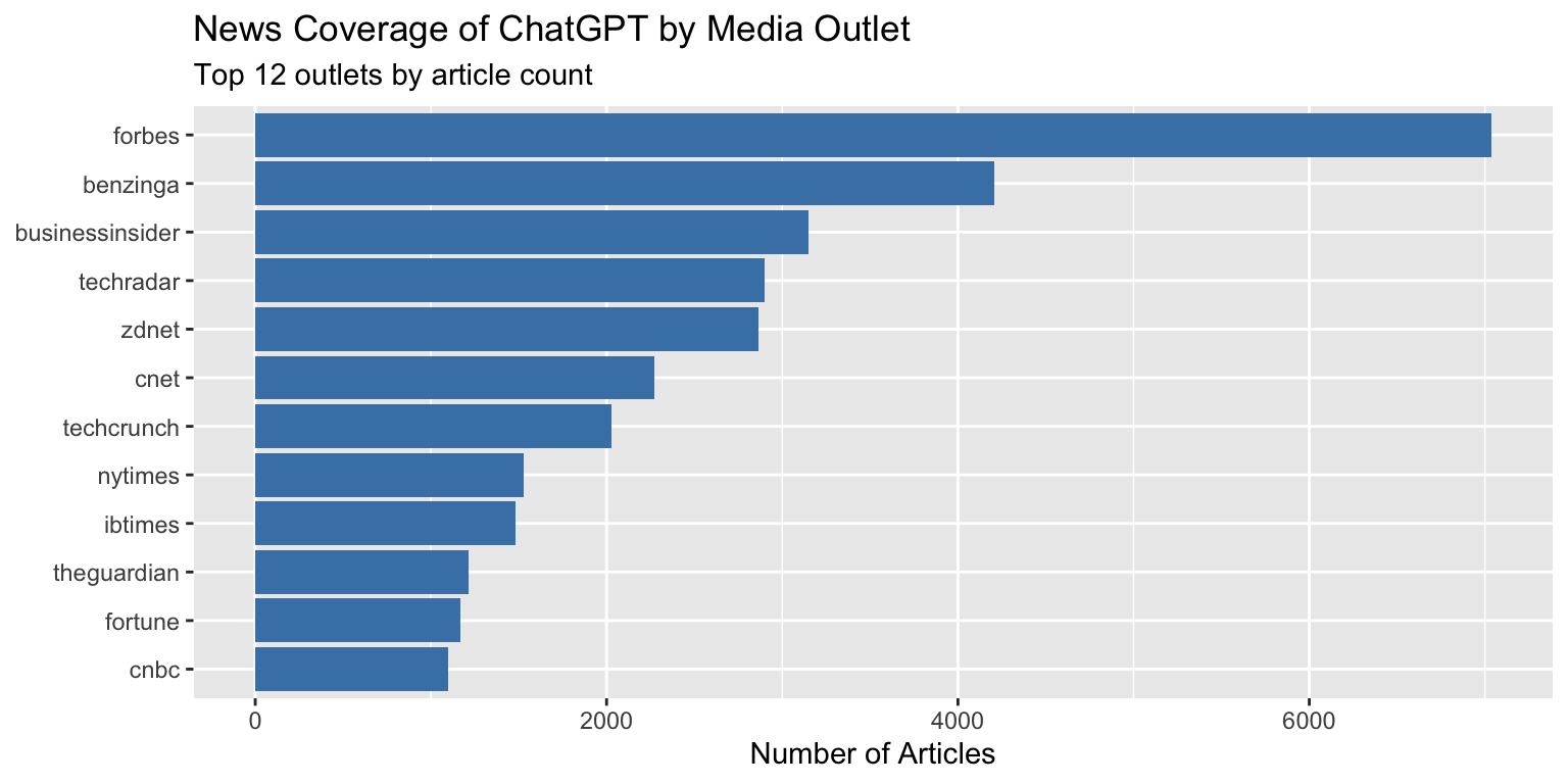
### Better / different Title Positioning
**Problem:** Default title positioning leaves awkward spacing
```{r title-position-problem}
#| fig-width: 8
#| fig-height: 4
ggplot(outlet_summary, aes(x = n_articles, y = reorder(outlet, n_articles))) +
  geom_col(fill = "steelblue") +
  labs(
    title = "News Coverage of ChatGPT by Media Outlet",
    subtitle = "Top 12 outlets by article count",
    x = "Number of Articles",
    y = NULL
  )
```
Notice how the title starts at the y-axis, not aligned with the plot area.
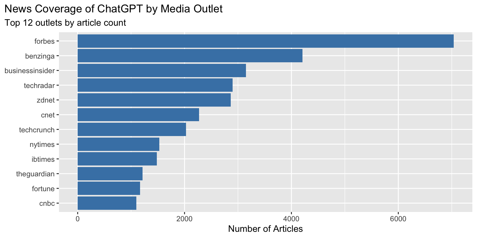
**With the tip applied:**
```{r title-position-solution}
#| fig-width: 8
#| fig-height: 4
ggplot(outlet_summary, aes(x = n_articles, y = reorder(outlet, n_articles))) +
  geom_col(fill = "steelblue") +
  labs(
    title = "News Coverage of ChatGPT by Media Outlet",
    subtitle = "Top 12 outlets by article count",
    x = "Number of Articles",
    y = NULL
  ) +
  theme(plot.title.position = "plot")
```
The title now aligns with the left edge of the entire plot area.
### Getting Rid of (Some) Gridlines
**Problem:** Too many gridlines clutter the plot
Usual `theme_minimal()` rendering:
```{r gridlines-problem}
#| fig-width: 8
#| fig-height: 4
ggplot(outlet_summary, aes(x = n_articles, y = reorder(outlet, n_articles))) +
  geom_col(fill = "steelblue") +
  theme_minimal() +
  labs(x = "Number of Articles", y = NULL)
```
**With the tip applied:**
```{r gridlines-solution}
#| fig-width: 8
#| fig-height: 4
ggplot(outlet_summary, aes(x = n_articles, y = reorder(outlet, n_articles))) +
  geom_col(fill = "steelblue") +
  theme_minimal() +
  theme(
    panel.grid.major.y = element_blank(),
    panel.grid.minor = element_blank()
  ) +
  labs(x = "Number of Articles", y = NULL)
```
Removing the horizontal gridlines makes the chart cleaner when bars already provide visual alignment.
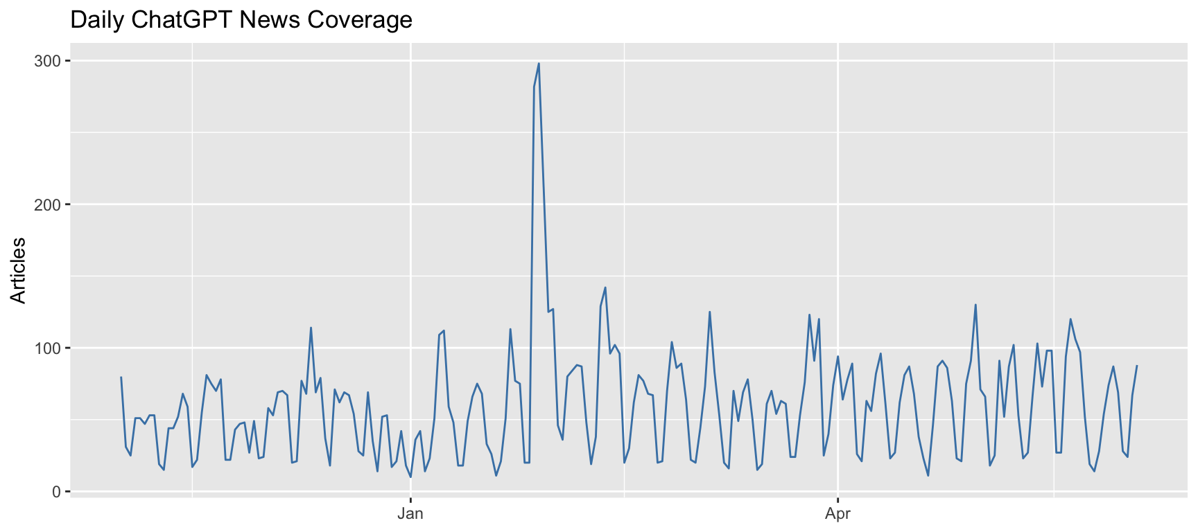
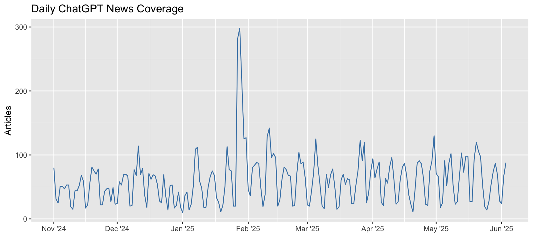
### Custom Date Axis Formatting
**Problem:** Default date formatting doesn't meet your needs
```{r date-format-problem}
#| fig-width: 9
#| fig-height: 4
ggplot(daily_counts, aes(x = date, y = n_articles)) +
  geom_line(color = "steelblue") +
  labs(
    title = "Daily ChatGPT News Coverage",
    x = NULL,
    y = "Articles"
  )
```
The date axis uses default formatting which may not be ideal.
Now the x-axis shows month abbreviations with year, which looks better:
```{r date-format-solution}
#| fig-width: 9
#| fig-height: 4
ggplot(daily_counts, aes(x = date, y = n_articles)) +
  geom_line(color = "steelblue") +
  scale_x_date(
    name = NULL,
    breaks = scales::breaks_width("1 month"),
    labels = scales::label_date("%b '%y")
  ) +
  labs(
    title = "Daily ChatGPT News Coverage",
    y = "Articles"
  )
```
### Fix Legend Order Mismatches
**Problem:** Legend colors don't match your data order
First, let's create data that shows this issue:
```{r legend-order-setup}
# Create category data
outlet_categories <- outlet_summary %>%
  mutate(
    category = case_when(
      outlet %in% c("forbes", "businessinsider", "cnbc") ~ "Business",
      outlet %in% c("techcrunch", "zdnet", "cnet", "techradar") ~ "Technology",
      TRUE ~ "General News"
    )
  ) %>%
  group_by(category) %>%
  summarise(total_articles = sum(n_articles)) %>%
  arrange(desc(total_articles))

outlet_categories
```
The legend order (alphabetical) doesn't match the bar order (by value):
```{r legend-order-problem}
#| fig-width: 6
#| fig-height: 4
ggplot(outlet_categories, aes(x = total_articles, y = reorder(category, total_articles), fill = category)) +
  geom_col() +
  labs(x = "Total Articles", y = NULL)
```
To guarantee the legend colors actually match the bar order, you must relevel the factor for `category` **before** plotting, using the ordering variable. This sets the order for both the bars and the legend:
```{r legend-order-solution}
#| fig-width: 6
#| fig-height: 4
# Set the category factor levels by total_articles (descending)
outlet_categories <- outlet_categories %>%
  mutate(category = forcats::fct_reorder(category, total_articles))

ggplot(outlet_categories, aes(x = total_articles, y = category, fill = category)) +
  geom_col() +
  labs(x = "Total Articles", y = NULL) +
  guides(fill = guide_legend(reverse = TRUE))
```
Now the legend order and colors will reflect the bar order exactly.
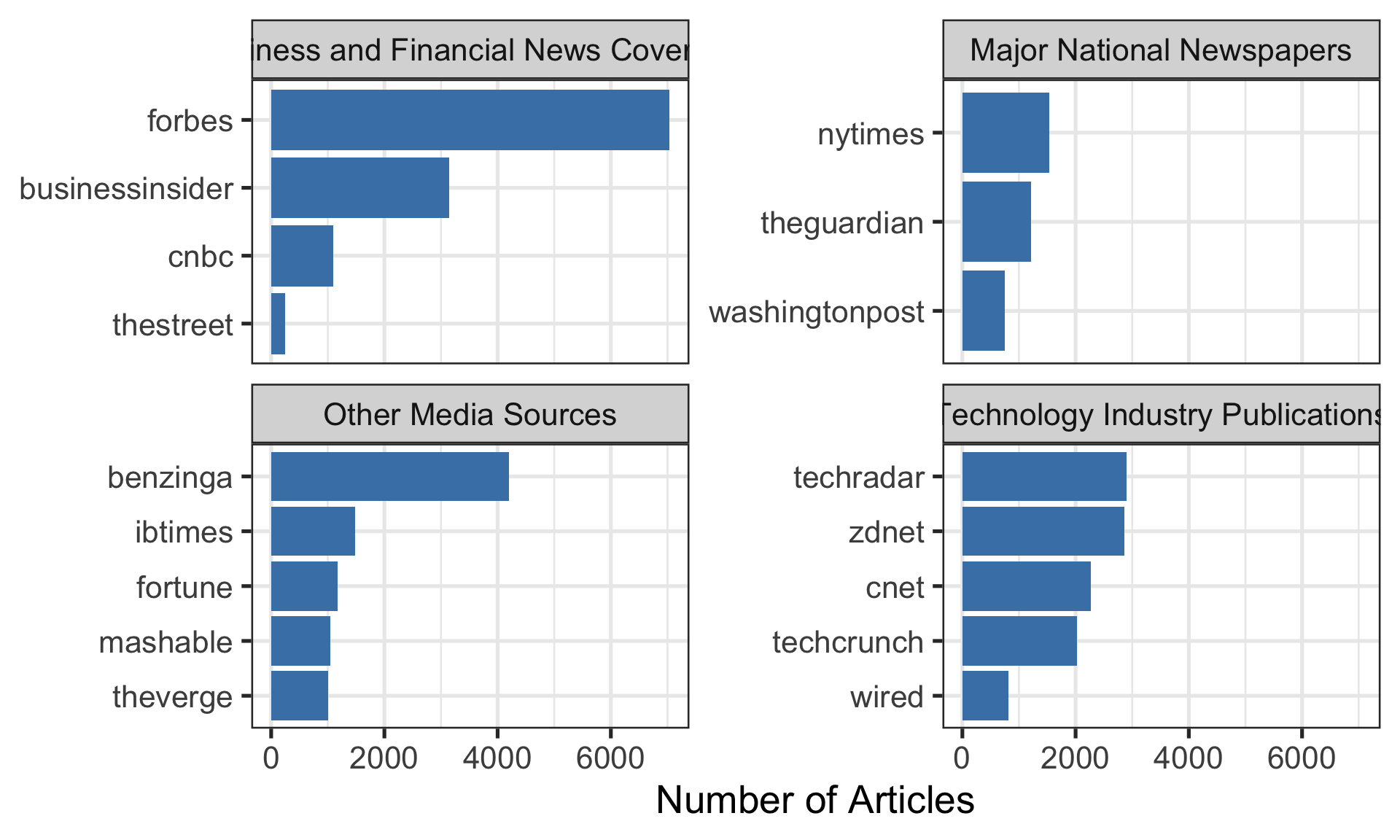
### Wrapping Long Labels in Facets
**Problem:** Long facet labels overlap or look messy
```{r facet-setup}
# Create data with long category names for faceting
outlet_by_category <- headlines %>%
  mutate(outlet = str_remove(media_url, "\\.com$|\\.org$|\\.net$")) %>%
  mutate(
    category = case_when(
      outlet %in% c("forbes", "businessinsider", "cnbc", "thestreet") ~
        "Business and Financial News Coverage",
      outlet %in% c("techcrunch", "zdnet", "cnet", "techradar", "wired") ~
        "Technology Industry Publications",
      outlet %in% c("theguardian", "nytimes", "washingtonpost") ~
        "Major National Newspapers",
      TRUE ~ "Other Media Sources"
    )
  ) %>%
  count(category, outlet) %>%
  group_by(category) %>%
  slice_max(n, n = 5)
```
```{r facet-problem}
#| fig-width: 10
#| fig-height: 6
ggplot(outlet_by_category, aes(x = n, y = reorder(outlet, n))) +
  geom_col(fill = "steelblue") +
  facet_wrap(~ category, scales = "free_y") +
  labs(x = "Number of Articles", y = NULL) +
  theme_bw(base_size=20)
```
The facet titles are cut off because they're too long.
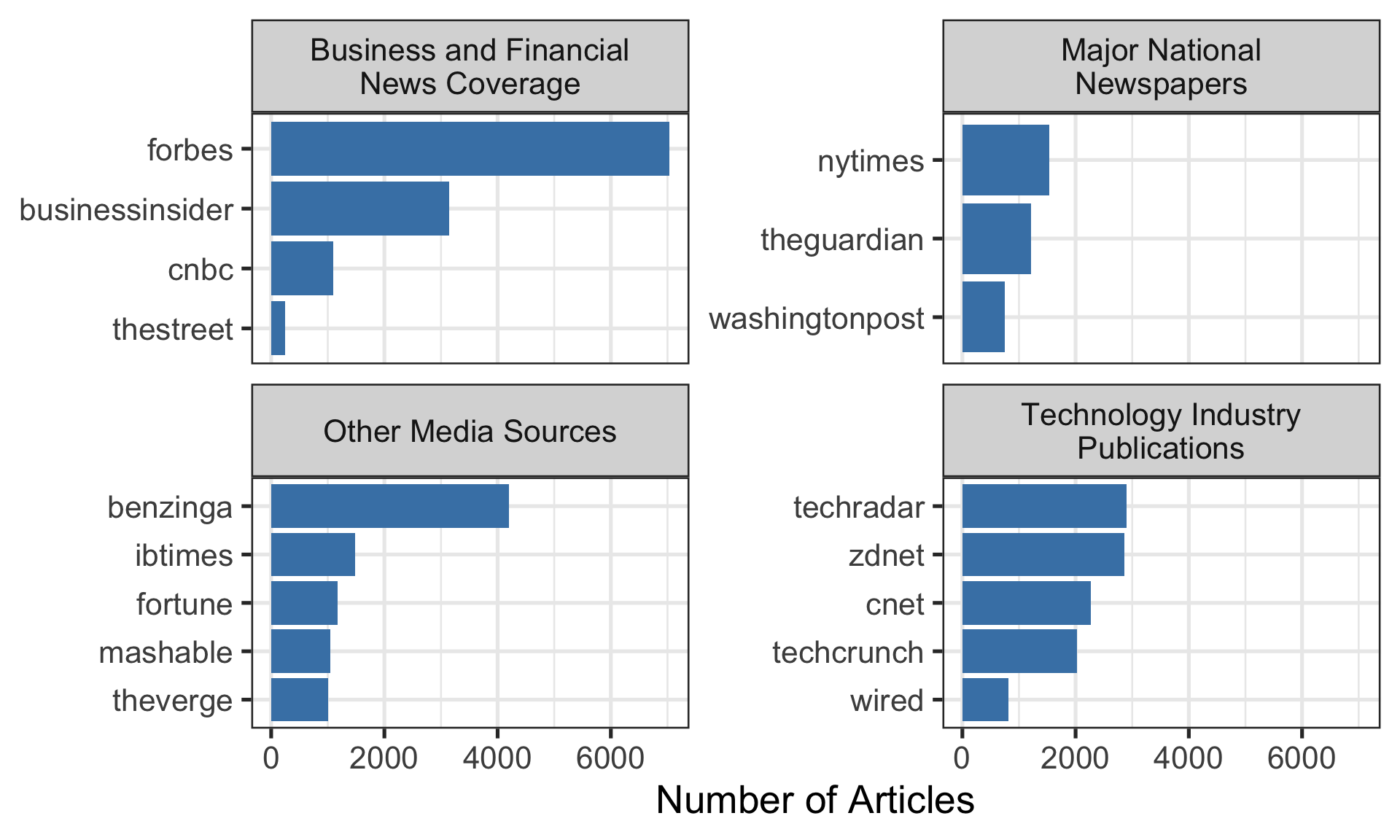
Solution
```{r facet-solution}
#| fig-width: 10
#| fig-height: 6
ggplot(outlet_by_category, aes(x = n, y = reorder(outlet, n))) +
  geom_col(fill = "steelblue") +
  facet_wrap(~ category, scales = "free_y", labeller = label_wrap_gen(width = 25)) +
  theme(strip.text = element_text(size = 9)) +
  labs(x = "Number of Articles", y = NULL) +
  theme_bw(base_size=20)
```
The `label_wrap_gen(width = 25)` wraps the facet titles at around 25 characters.
### Control Legend Visibility
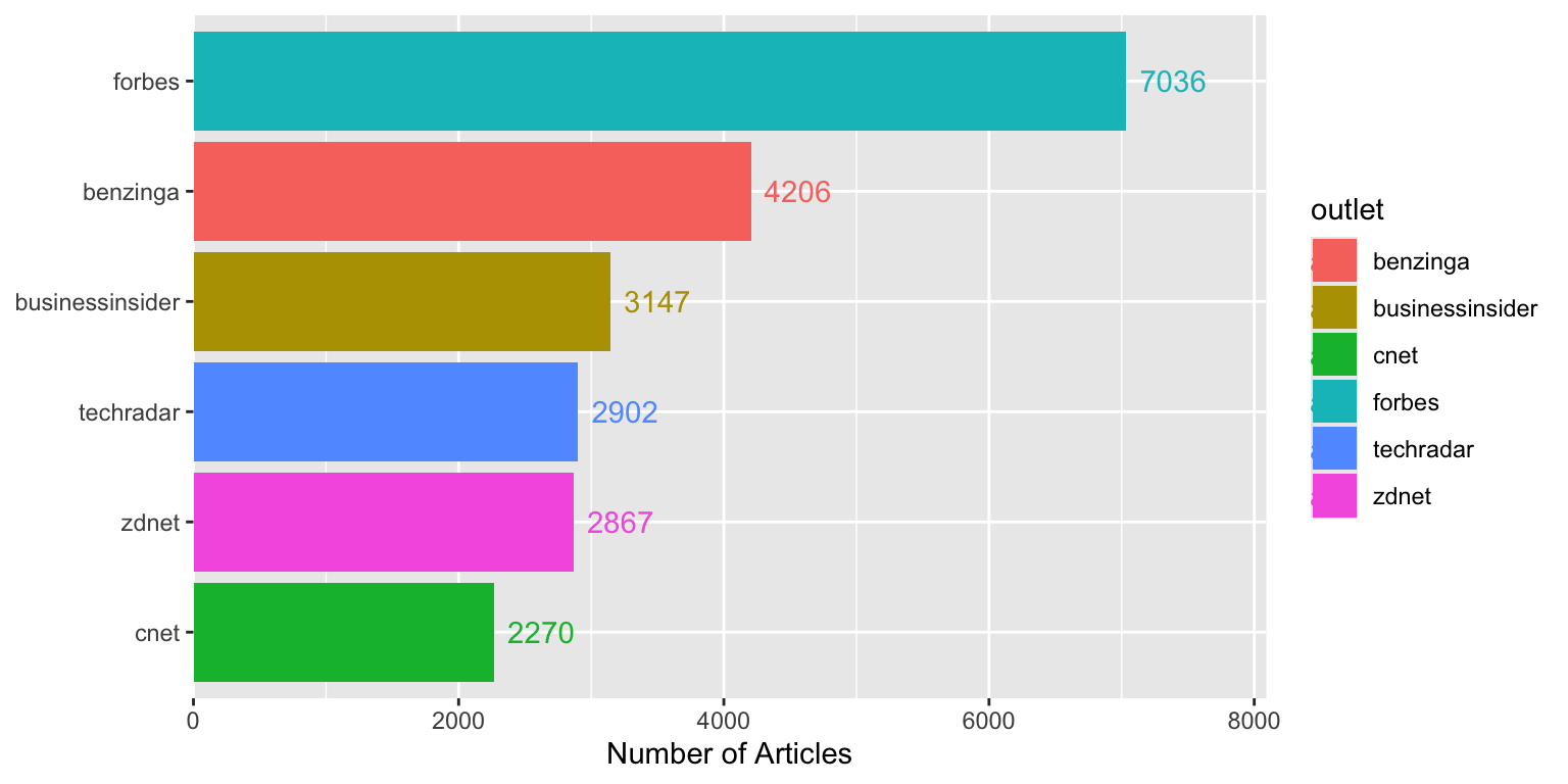
**Problem:** Unwanted legend entries from specific geoms
```{r legend-visibility-problem}
#| fig-width: 8
#| fig-height: 4
top_outlets <- outlet_summary %>% slice_max(n_articles, n = 6)

ggplot(top_outlets, aes(x = n_articles, y = reorder(outlet, n_articles), fill = outlet)) +
  geom_col() +
  geom_text(aes(label = n_articles, color = outlet), hjust = -0.2) +
  scale_x_continuous(expand = expansion(mult = c(0, 0.15))) +
  labs(x = "Number of Articles", y = NULL)
```
Both the bars and text create legend entries, which is redundant.
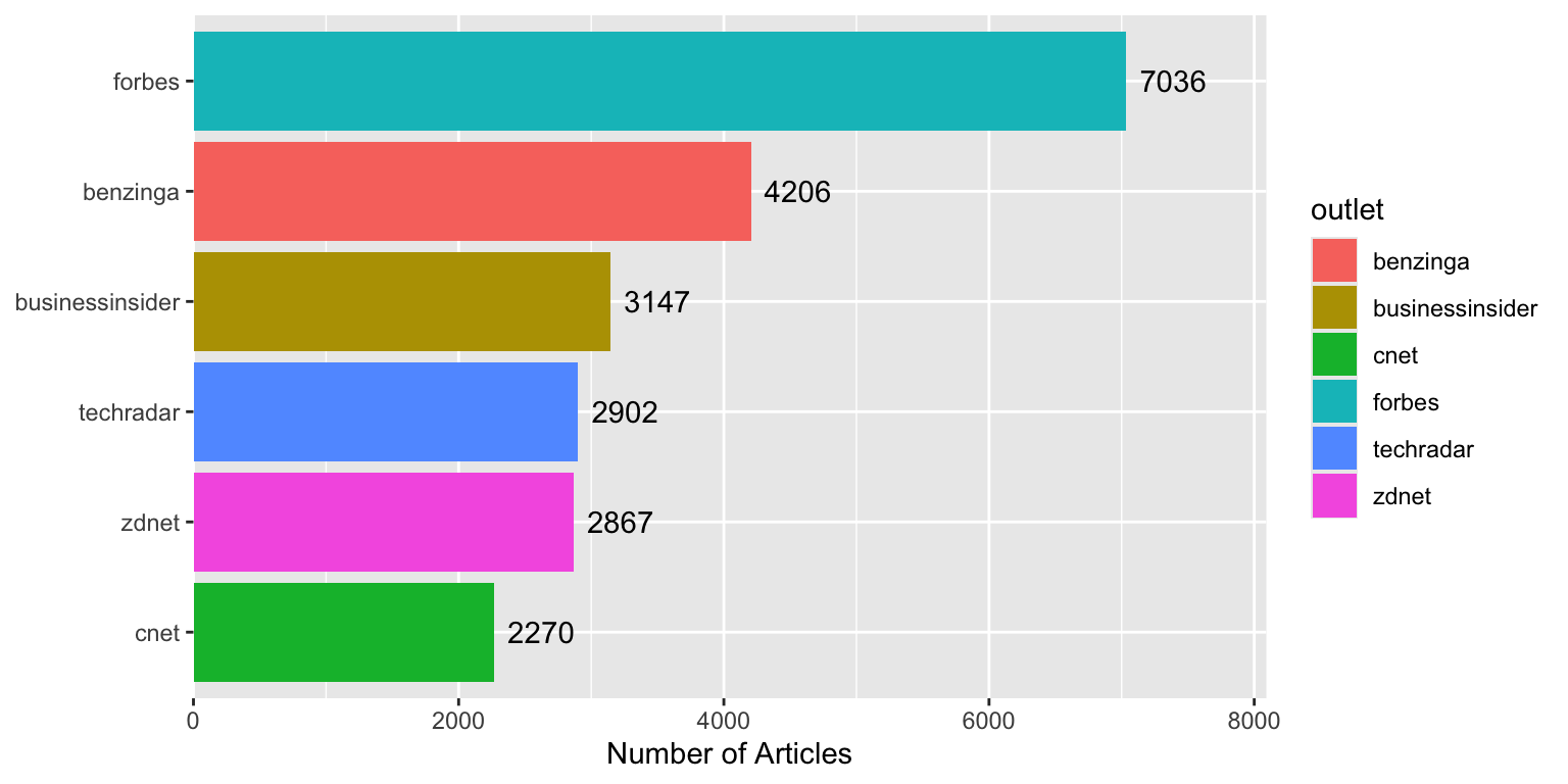
**With the tip applied:**
```{r legend-visibility-solution}
#| fig-width: 8
#| fig-height: 4
ggplot(top_outlets, aes(x = n_articles, y = reorder(outlet, n_articles), fill = outlet)) +
  geom_col() +
  geom_text(aes(label = n_articles), hjust = -0.2, show.legend = FALSE) +
  scale_x_continuous(expand = expansion(mult = c(0, 0.15))) +
  labs(x = "Number of Articles", y = NULL)
```
Using `show.legend = FALSE` removes unnecessary legend entries.
### Transparent Colors
**Problem:** Overlapping points or areas obscure underlying data
```{r transparent-setup}
# Create some overlapping data
set.seed(42)
scatter_data <- tibble(
  x = rnorm(2500, mean = 100, sd = 30),
  y = x + rnorm(2500, mean = 0, sd = 20)
)
```
**Without the tip:**
```{r transparent-problem}
#| fig-width: 6
#| fig-height: 5
ggplot(scatter_data, aes(x = x, y = y)) +
  geom_point(color = "steelblue", size = 3) +
  labs(title = "Overlapping points obscure density")
```
It's hard to see where points are concentrated.
**With the tip applied:**
```{r transparent-solution}
#| fig-width: 6
#| fig-height: 5
ggplot(scatter_data, aes(x = x, y = y)) +
  geom_point(color = scales::alpha("steelblue", 0.1), size = 2) +
  labs(title = "Transparency reveals density patterns")
```
Using `scales::alpha("steelblue", 0.1)` makes overlapping points visible.
## Part 2: Data Manipulation
### Subset Data Within ggplot
**Problem:** Need different data filtering for specific plot layers
```{r subset-ggplot-example}
#| fig-width: 9
#| fig-height: 4
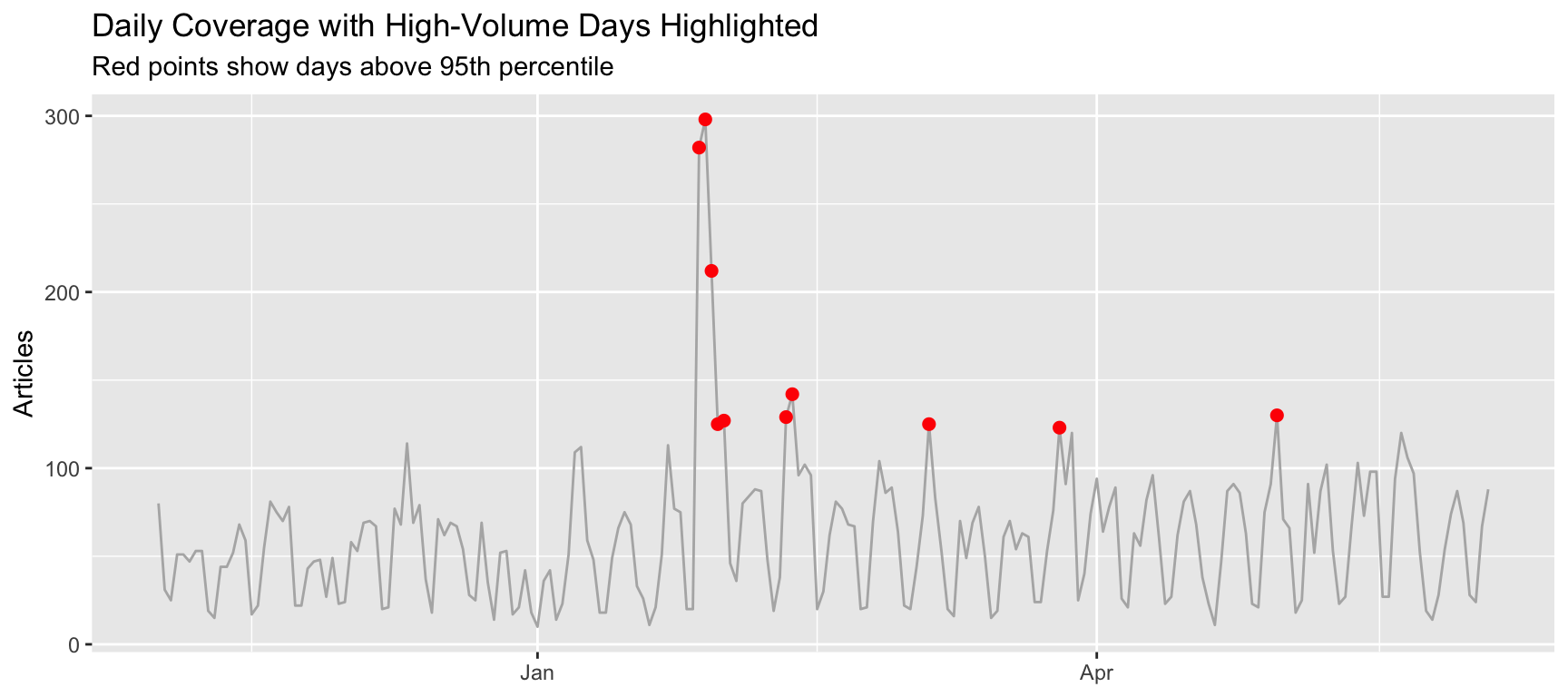
# Add some outlier detection
daily_with_outliers <- daily_counts %>%
  mutate(is_outlier = n_articles > quantile(n_articles, 0.95))

ggplot(daily_with_outliers, aes(x = date, y = n_articles)) +
  geom_line(color = "gray70") +
  geom_point(
    data = . %>% filter(is_outlier),
    color = "red", size = 2
  ) +
  labs(
    title = "Daily Coverage with High-Volume Days Highlighted",
    subtitle = "Red points show days above 95th percentile",
    x = NULL, y = "Articles"
  )
```
The `data = . %>% filter(is_outlier)` syntax filters data for just the points layer.
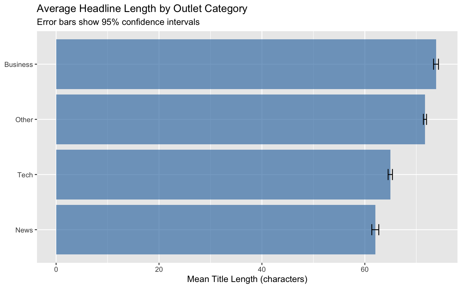
### Summary Statistics with Confidence Intervals
**Problem:** Need to show uncertainty in group means
```{r ci-example}
#| fig-width: 8
#| fig-height: 5
# Calculate mean and CI by outlet category
category_stats <- headlines %>%
  mutate(
    outlet = str_remove(media_url, "\\.com$|\\.org$|\\.net$"),
    title_length = nchar(title)
  ) %>%
  mutate(
    category = case_when(
      outlet %in% c("forbes", "businessinsider", "cnbc") ~ "Business",
      outlet %in% c("techcrunch", "zdnet", "cnet", "techradar") ~ "Tech",
      outlet %in% c("theguardian", "nytimes", "washingtonpost") ~ "News",
      TRUE ~ "Other"
    )
  ) %>%
  group_by(category) %>%
  summarise(
    M = mean(title_length, na.rm = TRUE),
    sd = sd(title_length, na.rm = TRUE),
    n = sum(!is.na(title_length)),
    se = sd / sqrt(n)
  )

ggplot(category_stats, aes(x = M, y = reorder(category, M))) +
  geom_col(fill = "steelblue", alpha = 0.7) +
  geom_errorbar(
    aes(xmin = M - 1.96*se, xmax = M + 1.96*se),
    width = 0.2
  ) +
  labs(
    title = "Average Headline Length by Outlet Category",
    subtitle = "Error bars show 95% confidence intervals",
    x = "Mean Title Length (characters)",
    y = NULL
  )
```
### Filter by Minimum Observations
**Problem:** Need to calculate statistics only for groups with sufficient sample sizes
```{r filter-min-obs-example}
# Only calculate stats for outlets with enough articles
outlet_stats <- headlines %>%
  mutate(
    outlet = str_remove(media_url, "\\.com$|\\.org$|\\.net$"),
    title_length = nchar(title)
  ) %>%
  group_by(outlet) %>%
  summarize(
    n_articles = n(),
    mean_length = ifelse(
      n_articles >= 50,
      mean(title_length, na.rm = TRUE),
      NA
    )
  ) %>%
  filter(!is.na(mean_length)) %>%
  slice_max(n_articles, n = 10)

outlet_stats
```
Using `ifelse(n_articles >= 50, ...)` ensures we only calculate statistics for outlets with at least 50 articles.
## Part 3: External Data Access
### Harvard Dataverse Integration
**Problem:** Need to access publicly available research datasets
**Solution:**
```{r dataverse}
#| eval: false
# Set up connection to Harvard Dataverse
Sys.setenv("DATAVERSE_SERVER" = "dataverse.harvard.edu")

# Download dataset directly into R
dataset <- dataverse::get_dataframe_by_name(
  "filename.tab",
  "doi:10.7910/DVN/XXXXXX"  # Replace with actual DOI
)
```
**Resources:** [CRAN dataverse package vignette](https://cran.r-project.org/web/packages/dataverse/vignettes/A-introduction.html)
## Additional Resources
- **This collection:** [github.com/zilinskyjan/R-snippets](https://github.com/zilinskyjan/R-snippets)
- **Allison Koh's collection:** [github.com/allisonkoh/helpful-code-stuff](https://github.com/allisonkoh/helpful-code-stuff)
- **Silvia Kim's workshop notes:** <https://sysilviakim.com/learningR/>