---
output: html_document
editor_options:
chunk_output_type: console
---
## Principles
## There are always tradeoffs
A frequent tradeoff can be thought of as **truthfulness** vs. simplicity.
In other words, you will need to balance:
- Readability vs. "completeness"
- Conciseness vs. an "attention-grabbing" potential
- Simplicity vs. other goals
If you drop outliers, for example, your chart's readability will almost surely improve. But it could be less truthful.
## Questions to ask yourself
1. What chart type is appropriate for my situation?
- Can I try a few options?
- And is this a case where a (simple!) table would be more effective to communicate what you found?
2. Did I spend at least a few minutes making some thoughtful design choice (amount of text, labels, annotations; color choice; font size) so that my chart is clear and reasonably self-contained?
- How much data would you want to display? ...to convey your findings clearly & credibly?
3. How much data is necessary?
- ...to convince yourself that your story is truthful?
## Back to readability vs. "completeness"
If you label a subset of your observations, then arguably some information "is lost", unless you post your data.
```{r}
#| echo: true
#| code-fold: true
#| code-summary: "Load the data"
library(tidyverse)
# Get fiscal data
imf <- read_csv("data/macro/imf-fiscalmonitor-apr2023.csv")
# Reformat data to wide and keep only the latest year
imf_wide2022 <- imf %>% select(variable,country,`2022`) %>%
  pivot_wider(names_from = variable, values_from = `2022`)
# Merge in inflation data:
inf <- read_csv("data/macro/inflation_WDI.csv")
inf2022 <- inf %>% filter(year==2022)
econ2022 <- left_join(imf_wide2022,inf2022,by="country")
```
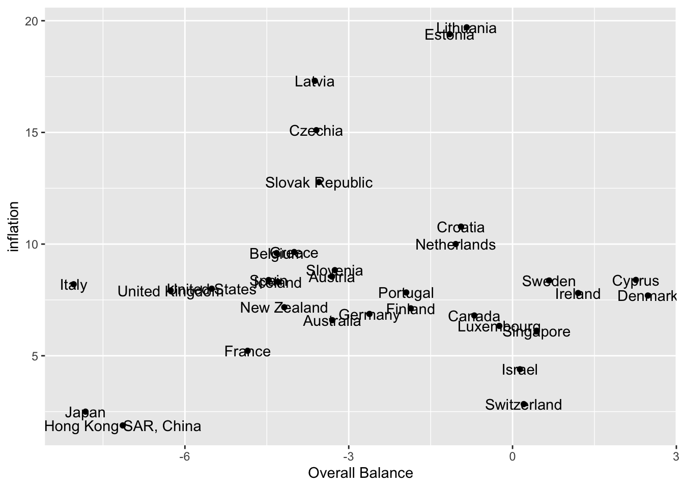
You may agree that you should almost never make graphs that look like this:
```{r}
#| echo: false
econ2022 %>%
filter(country != "Norway") %>%
ggplot(aes(y=inflation,
x=`Overall Balance`,
label=country)) +
geom_point() +
geom_text()
```
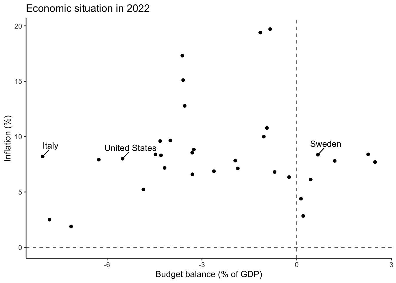
When you can make charts like this instead:
```{r}
#| echo: false
econ2022 %>%
filter(country != "Norway") %>%
ggplot(aes(y=inflation,
x=`Overall Balance`)) +
geom_point() +
ggrepel::geom_text_repel(data=econ2022 %>%
filter(country %in% c("Italy",
"Sweden",
"United States")),
aes(label=country),nudge_x=.25,nudge_y=1) +
labs(title = "Economic situation in 2022",
x="Budget balance (% of GDP)", y= "Inflation (%)") +
theme_classic() +
geom_hline(yintercept = 0,linetype=2,color="grey40") +
geom_vline(xintercept = 0,linetype=2,color="grey40")
```
The code for both charts is shown below. Notice something?
```{r}
#| echo: true
#| eval: false
#| code-fold: true
#| code-summary: "Show code"
# Chart 1 (basic version; the draft 0)

econ2022 %>%
  filter(country != "Norway") %>%
  ggplot(aes(y=inflation,x=`Overall Balance`,label=country)) +
  geom_point() +
  geom_text()

# Chart 2 (the cleaner version)

econ2022 %>%
  filter(country != "Norway") %>%
  ggplot(aes(y=inflation,
         x=`Overall Balance`)) +
  geom_point() +
  ggrepel::geom_text_repel(data=econ2022 %>%
                             filter(country %in% c("Italy",
                                                   "Sweden",
                                                   "United States")),
           aes(label=country),nudge_x=.25,nudge_y=1) +
  labs(title = "Economic situation in 2022",
        x="Budget balance (% of GDP)", y= "Inflation (%)") +
  theme_classic() +
  geom_hline(yintercept = 0,linetype=2,color="grey40") +
  geom_vline(xintercept = 0,linetype=2,color="grey40")
```
It turns out that whoever wrote the code decided to just drop a row (and not display Norway). Is that OK?
```{r}
#| echo: true
#| eval: true
#| code-fold: true
#| code-summary: "Is the balance data skewed?"
econ2022 %>% select(`Overall Balance`,country) %>%
  arrange(desc(`Overall Balance`))
```
## Example: Making scatterplots better
Starting in 2021, inflation increased in many countries and became a source of serious concern for citizens and politicians. One set of substantive debates dealt with this set of questions: should governments be blamed for excessive spending (and borrowing)? Were fiscal decisions responsible for inflation? Here, we'll deal with one potential approach to designing visual exhibits which might facilitate some international comparisons.[^1_principles-1]
[^1_principles-1]: But also remember that evidence of this kind can inform factual debates but it wouldn't settle the debate.
Let's get some [data](https://github.com/zilinskyjan/DataViz/tree/main/data/macro) (available via the Github repo)
```{r}
#| echo: true
#| eval: false
library(tidyverse)
imf <- read_csv("https://raw.githubusercontent.com/zilinskyjan/DataViz/main/data/macro/imf-fiscalmonitor-apr2023.csv")
```
```{r}
#| echo: false
#| eval: true
# Get fiscal data
imf <- read_csv("data/macro/imf-fiscalmonitor-apr2023.csv")
```
The following variables are available, all expressed as percentages of GDP:
```{r}
unique(imf$variable)
```
Let's view the first 3 rows to get a sense of the structure:
```{r}
head(imf,3)
```
If we wanted each row to correspond to one country-year observation, we would run this snippet:
```{r}
imf %>% pivot_longer(cols=`2014`:`2023`,
                     names_to = 'year')  # this part is not necessary but it's useful
```
But we'll focus here on year 2022, so let's simply create 3 informative columns:
```{r}
# Reformat data to wide and keep only the latest year
imf_wide2022 <- imf %>% select(variable,country,`2022`) %>%
  pivot_wider(names_from = variable, values_from = `2022`)
```
```{r}
imf_wide2022
```
Finally, we want to add inflation data to our fiscal data:
```{r}
# Merge in inflation data:
inf <- read_csv("data/macro/inflation_WDI.csv")
inf2022 <- inf %>% filter(year==2022)

econ2022 <- left_join(imf_wide2022,inf2022,by="country")
```
So we will work with the `econ2022` data object for a moment.
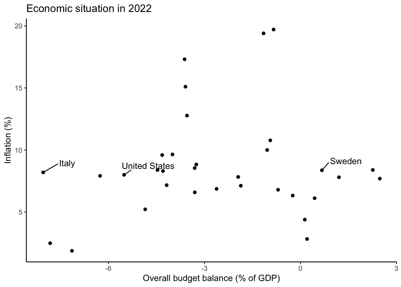
This chart displays the relationship between public budget deficits and inflation.
```{r}
# Make a simple plot:
econ2022 %>%
  filter(country != "Norway") %>%
  ggplot(aes(y=inflation,
         x=`Overall Balance`,
         label=country)) +
  geom_point() +
  geom_text() +
  labs(title = "Economic situation in 2022",
        x="Overall budget balance (% of GDP)", y= "Inflation (%)")
```
A few things to notice:
- We are not displaying Norway (can you check why?)
- We added an informative title to the scatterplot
- We made the questionable choice to use `geom_text()` which uses what we placed inside `aes(... label=country)`.
The same data can be displayed this way; `ggrepel::geom_text_repel()` is helpful in this context:
```{r}
econ2022 %>%
  filter(country != "Norway") %>%
  ggplot(aes(y=inflation,
         x=`Overall Balance`,
         label=country)) +
  geom_point() +
  ggrepel::geom_text_repel() +
  labs(title = "Economic situation in 2022",
        x="Overall budget balance (% of GDP)", y= "Inflation (%)")
```
Or you can highlight a subset of observations relevant for your analysis.
Let's create a vector of country names:
```{r}
subset <- c("Italy","Sweden","United States")
```
We'll want to insert `data=econ2022 %>% filter(country %in% subset)` into `geom_text_repel`:
```{r}
scatter1 <- econ2022 %>%
  filter(country != "Norway") %>%
  ggplot(aes(y=inflation,
         x=`Overall Balance`)) +
  geom_point() +
  ggrepel::geom_text_repel(data=econ2022 %>%
                             filter(country %in% subset),
           aes(label=country),nudge_x=.75,nudge_y=.75) +
  labs(title = "Economic situation in 2022",
        x="Overall budget balance (% of GDP)", y= "Inflation (%)") +
  theme_classic()

scatter1
```
Adding a layer and selecting attributes for a specific subset of points is a general, more widely applicable, approach:
```{r}
scatter1 +
  geom_point(data=econ2022 %>% filter(country %in% subset),
             color="red")
```
Note also that I also that it could have been tempting to label the x-axis as showing "Public deficit" because we almost always talk about deficits. But that would have been misleading, given that only negative values on the x-axis would have denoted the deficit.
We see that deficit spending is not informative: moderately high inflation was common across OECD countries; neither large deficits, nor budget surpluses, were prognostic of better/worse outcomes.
### Total government spending and (contemporaneous) inflation
What about total government spending? We can check:
```{r}
econ2022 %>%
  ggplot(aes(y=inflation,
         x=`General Government Expenditure`)) +
  geom_point() +
  ggrepel::geom_text_repel(data=econ2022 %>%
                             filter(country %in% c("Italy",
                                                   "Sweden",
                                                   "United States")),
           aes(label=country),nudge_y=.5,nudge_x=-.5) +
  labs(title = "Economic situation in 2022",
        x="Public spending (% of GDP)", y= "Inflation (%)")
```
This would seem to suggest that higher (government) spending is not necessarily associated with faster price growth.
To be sure, a more careful analysis here would require looking it **changes** in government expenditures.
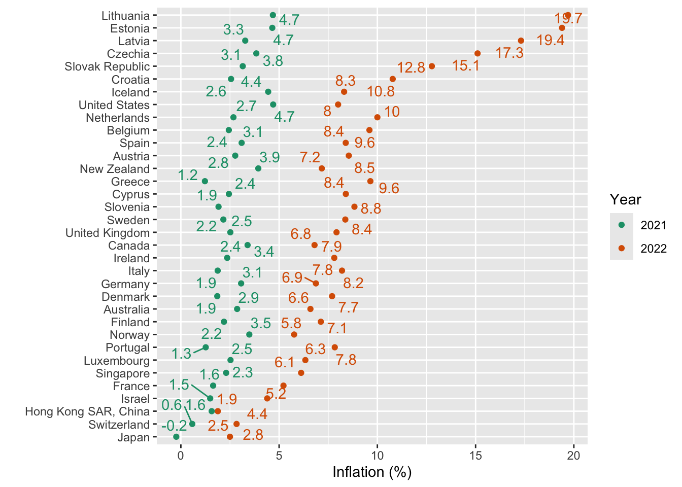
## Inflation magnitudes
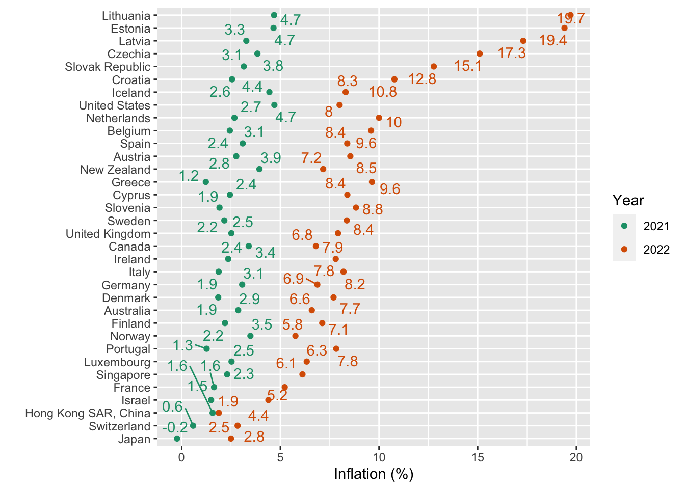
Here are a few ways to show how sharply inflation increased between 2021 and 2022 in most OECD countries:
### A basic dot plot
```{r}
inf %>% filter(iso3c %in% econ2022$iso3c) %>%
  filter(year>=2021) %>%
  mutate(avg = mean(inflation), .by = country) %>%
  ggplot(aes(x=inflation,
             color= factor(year),
             y=fct_reorder(country,avg))) +
  geom_point() +
  ggrepel::geom_text_repel(aes(label=round(inflation,1)),
                           show.legend = FALSE) +
  scale_color_brewer(palette = 2,type = "qual") +
  labs(x="Inflation (%)",y="",color="Year")
```
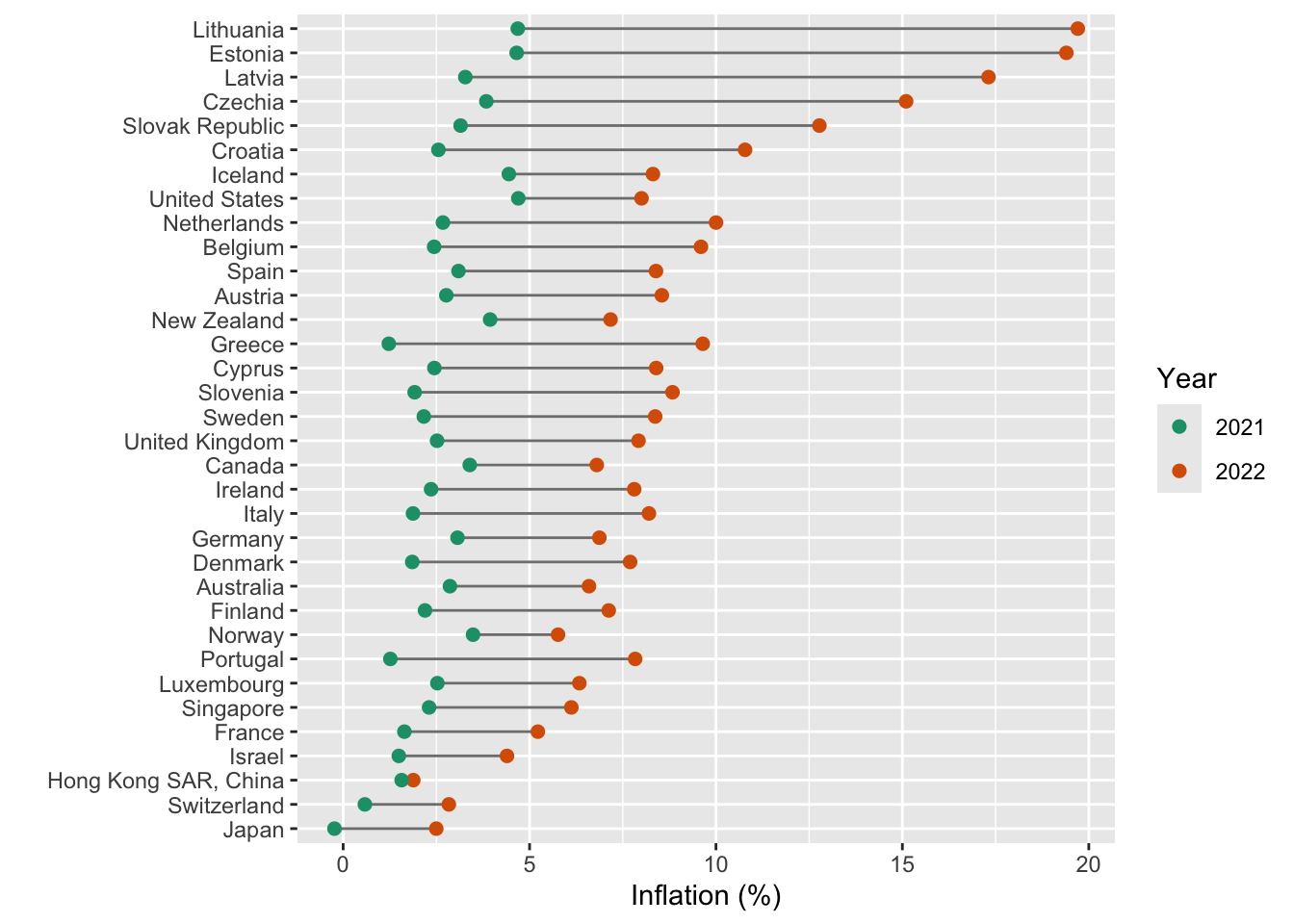
### A dumbbell chart
```{r}
inf %>% filter(iso3c %in% econ2022$iso3c) %>%
  filter(year>=2021) %>%
  mutate(avg = mean(inflation), .by = country) %>%
  ggplot(aes(x=inflation,
             color= factor(year),
             y=fct_reorder(country,avg))) +
  geom_line(aes(group=country),color="grey50") +
  geom_point(size=2) +
  scale_color_brewer(palette = 2,type = "qual") +
  labs(x="Inflation (%)",y="",color="Year")
```
Above we simply added a `geom_line(aes(group=country),color="grey50")` and made sure that the line was plotted before the points were added for each country (for aesthetic reasons).
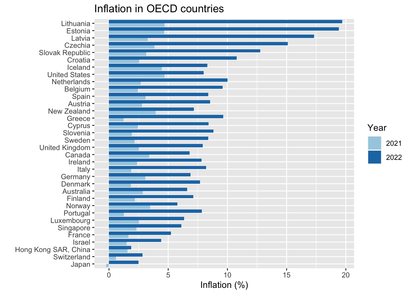
### A standard chart
Or you could make a bar chart:
```{r}
inf %>% filter(iso3c %in% econ2022$iso3c) %>%
  filter(year>=2021) %>%
  mutate(avg = mean(inflation), .by = country) %>%
  ggplot(aes(x=inflation,
             fill= factor(year),
             y=fct_reorder(country,avg))) +
  geom_col(position = position_dodge()) +
  scale_fill_brewer(palette = 3,type = "qual") +
  labs(x="Inflation (%)",y="",fill="Year",title = "Inflation in OECD countries")
```
Note that we:
- had to change `color` to `fill` within `aes()`\
- we also had to make that change within `labs()`
- changed `scale_color_brewer` to `scale_fill_brewer`
- replaced `geom_point()` with `geom_col(position = position_dodge())`
## Exercise: Inflation and government spending
Use the provided datasets to explore whether **an increase** in government spending predicts (current or future) inflation.
Consider the following issues and provide brief justifications:
- Let the focal year of interest be T = 2022. Is it sensible to compare T with T-1? What if the fiscal effect materializes with a lag? And would it be appropriate to compare current spending to pre-pandemic spending?
- Should past spending be subtracted from "current" spending at time T? If your answer is yes, remember that you would be reporting differences *expressed in percentage points*. (Don't slip, using the symbol "%" would be misleading...)